would enable you to enjoy an array of other services such as Member Rankings, User Groups, Own Posts & Profile, Exclusive Research, Live Chat Box etc..
 Latest*


I am a simple trader so I like simple analysis tools.
Here is one I used during last few months to gain consistent profits - during market drop.
I believe it'll stand its ground during, at least, few more months to come.
Simply, it worked for me and I believe there is no reason for it not to work for you guys (If you are not very greedy)
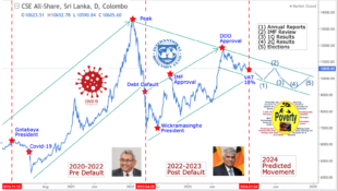
Here is the tool in one picture.

https://i.servimg.com/u/f47/16/67/25/58/simple10.jpg
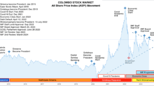
This is a two year (Price - candlestick) chart of ASI.
The two arrow lines are supposed to be a resistance level line and a support level line (I guess you know these jargon). -Medium to long term.
The cycle line is meant to represent the cyclic nature of the market - short to medium term.

The idea is to buy when ASI is near the support in and near a cycle bottom. And sell near the resistant line and near a cycle top.
The cycle line and he trend lines need to compliment each other.
That's all.

I am sharing this will all good intentions.
Your comments are welcome.
Please let me know if you think we can further improve and simplify this.
Remember! I am a simple swing trader.
PS:
Together with this, in order to get a broader picture of the market, you may look at the picture I posted earlier.
http://forum.srilankaequity.com/t14785-a-picture-worth-thousand-words#95782
You can easily compare the two pics.
My thanks to @sriranga who had posted it earlier. Thanks mate!
Cheers!!
/Hunter
Here is one I used during last few months to gain consistent profits - during market drop.
I believe it'll stand its ground during, at least, few more months to come.
Simply, it worked for me and I believe there is no reason for it not to work for you guys (If you are not very greedy)
Here is the tool in one picture.
https://i.servimg.com/u/f47/16/67/25/58/simple10.jpg
This is a two year (Price - candlestick) chart of ASI.
The two arrow lines are supposed to be a resistance level line and a support level line (I guess you know these jargon). -Medium to long term.
The cycle line is meant to represent the cyclic nature of the market - short to medium term.
The idea is to buy when ASI is near the support in and near a cycle bottom. And sell near the resistant line and near a cycle top.
The cycle line and he trend lines need to compliment each other.
That's all.
I am sharing this will all good intentions.
Your comments are welcome.
Please let me know if you think we can further improve and simplify this.
Remember! I am a simple swing trader.
PS:
Together with this, in order to get a broader picture of the market, you may look at the picture I posted earlier.
http://forum.srilankaequity.com/t14785-a-picture-worth-thousand-words#95782
You can easily compare the two pics.
My thanks to @sriranga who had posted it earlier. Thanks mate!
Cheers!!
/Hunter